
I have enjoyed Azeroth's immersive experience and beautiful scenery while playing World of Warcraft on my ultra-wide 49” monitor, particularly in the Shadowlands expansion. However, the use of the 2004 UI in this expansion has been a limitation, as it could only be modified with certain add-ons such as Bartender and MoveAnything. With the release of the new expansion, many of these add-ons are no longer compatible, which has negatively impacted my gameplay experience. While the World of Warcraft team has significantly improved the game's UX/UI, there is still room for further enhancements. In this case study, we will focus on the Micro Menu as a specific area for improvement in the World of Warcraft UX/UI. We will also examine the impact of the new HUD changes on wide monitor users and how these changes affect a particular group of players. The goal of this case study is to identify challenges and propose potential solutions to enhance the overall gameplay experience for all World of Warcraft players.
Micro Menu
In a survey of 10 random World of Warcraft players (new and old players) on the Discord community, we found that:
1- 60% liked the minimalist style
2- 100% had difficulty reading the micro menu by hovering over the icons
3- 90% wished the micro menu was more visible in scale and colour.
4- 40% did not care about the menu and used shortcuts (Mainly old players)
2- 100% had difficulty reading the micro menu by hovering over the icons
3- 90% wished the micro menu was more visible in scale and colour.
4- 40% did not care about the menu and used shortcuts (Mainly old players)
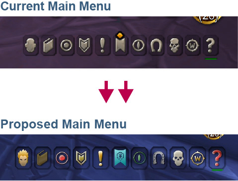
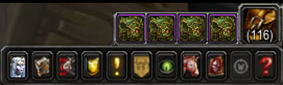
As shown in Figure 1.2, the Micro Menu is located in the bottom right corner of the World of Warcraft user interface. Currently, players cannot move or scale the menu, which poses problems for accessibility and inclusivity. Most icons in the menu have a similar appearance and have a single value of colour, making it difficult for players to understand their purpose (as seen in Figure 1.3). This design goes against many UX design principles and guidelines. As a designer, I feel that the redesign of the Micro Menu lacks consistency with the game's overall design.
For example, the "Looking for a group" icon was redesigned to be a simplified, minimalist icon resembling an eye. However, when the player joins a queue for a dungeon or Arena match, the icon appears next to the main menu with a cool animation. Inconsistency in the main menu can be confusing and detract from the overall aesthetic.
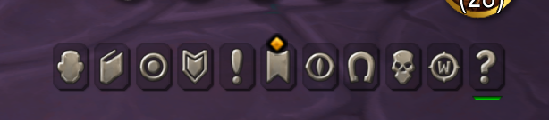
Screenshot of the current micro menu in WoW (Fig 1.1)
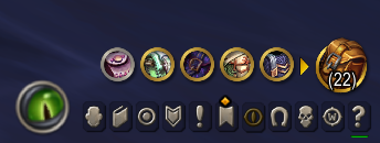
Looking for a Group eye Icon
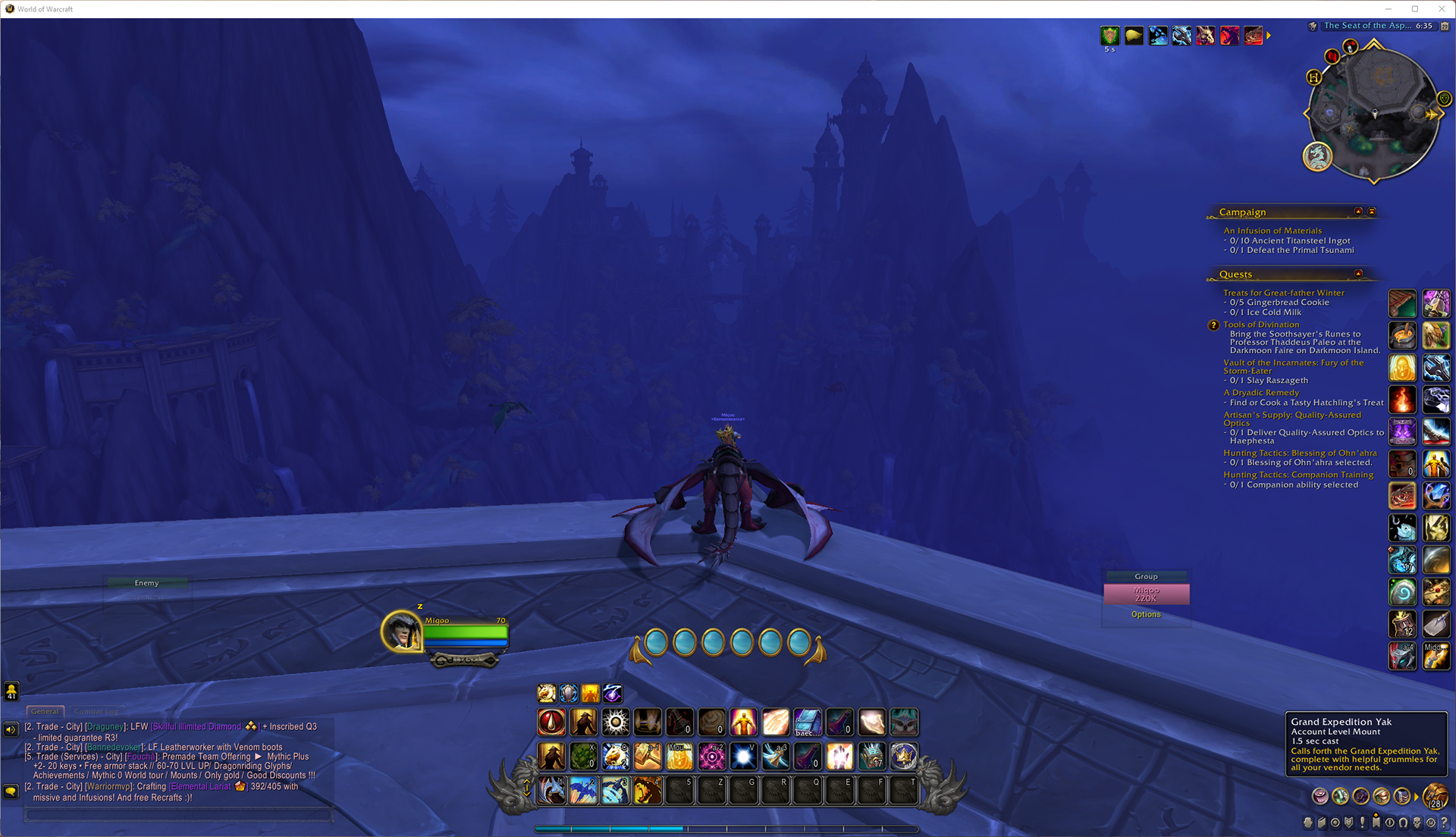
Fig 1.2
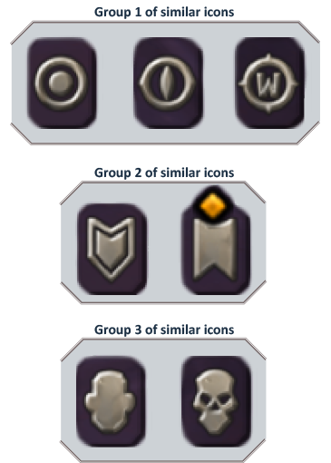
Fig 1.3
To address these issues, we suggest the following solutions:
1- Allow players to move and scale the menu to their preference.
2- Make the main menu visible by adding more colours and visual weight.
2- Make the main menu visible by adding more colours and visual weight.
1- Moving and scaling the micro menu
To begin the redesign process, I started with the player Journey (Fig 1.4); then, I created a wireframe (Fig 1.5) of the steps for scaling and moving the Micro Menu. I used Illustrator and Photoshop to recreate the icons and update some menus to make my first prototype. One challenge I faced was that the original icon I worked from was pixelated, so I apologize if the recreated icons are different.
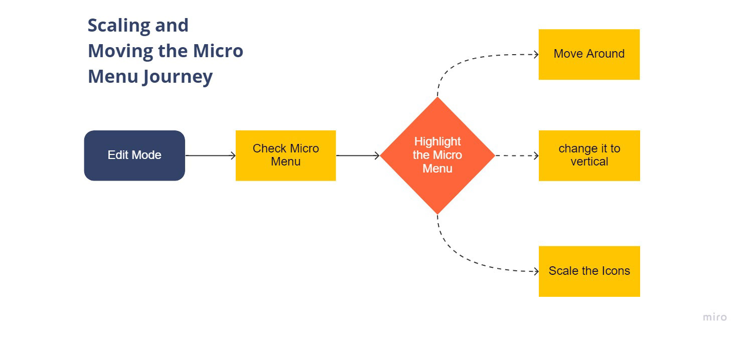
Fig 1.4
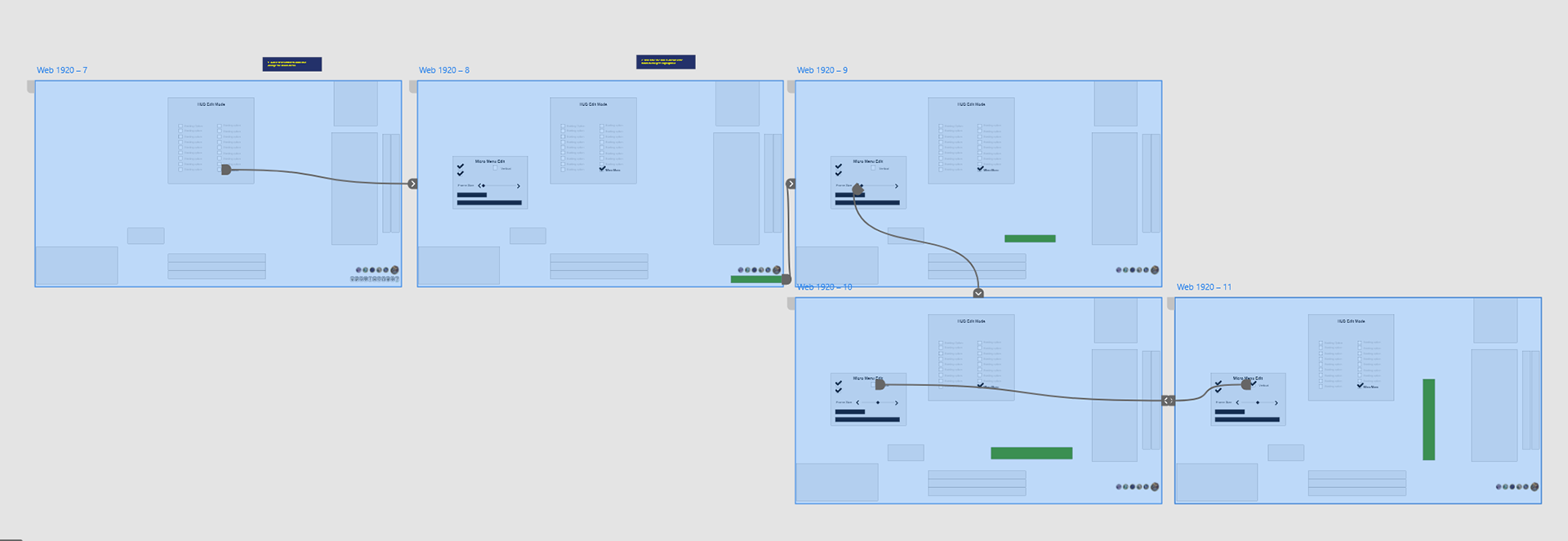
Fig 1.5
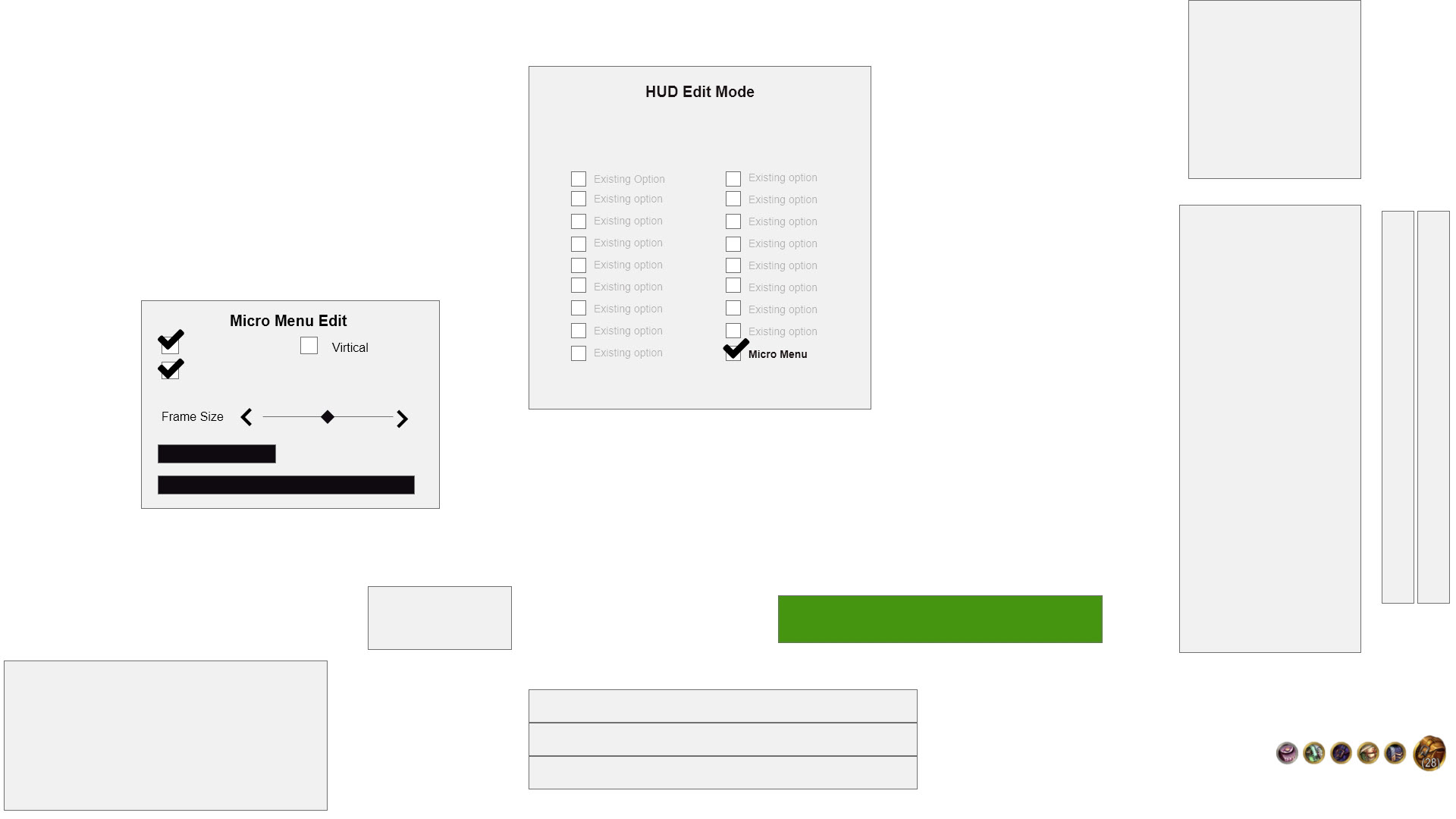
Fig 1.6
This is a video of the prototype
2- Adding colours and visual weight to the Icons
One of my favourite aspects of this project was taking the existing icons and updating them. While the old menu in World of Warcraft (shown in Figure 1.7) was more visible and readable, I agree that it needed an update. By combining elements of the new minimalist Micro Menu with some features of the old menu, I was able to create icons that were more visible and readable. When the new menu was tested on 5 players, they all reported that it was more enjoyable and easier to understand.
World of Warcraft Old Menu ( Fig 1.7)
New Proposed Menu - Part 1 (Fig 1.8, 1.9)
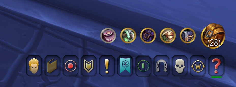
Fig 1.8
Micro Menu in game (Fig 1.8)
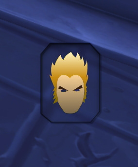
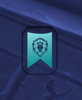
Personalization in video games is essential for creating a more personalized and memorable experience for players. With this in mind, I included elements of personalization in the redesign of the icons for the new menu. For example, in the Character icon (shown in Figure 1.9), players will be able to see an icon that resembles their character's race. Similarly, the Guild icon (shown in Figure 1.10) will display the color and emblem of the player's guild. These personalized features add a level of immersion and connection for the player.
(Fig 1.9)
(Fig 1.10)
New Proposed Menu - Part 2
I experimented with the idea of using the same icons created by Blizzard, but adding a hover animation to them. The image below (Figure 1.11) is an example of this animation, or you can watch the video for a better understanding. This added element of interaction and visual appeal to the icons.
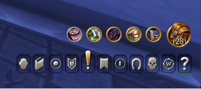
Fig 1.11
Ultra Wide Monitors and the Player Experience
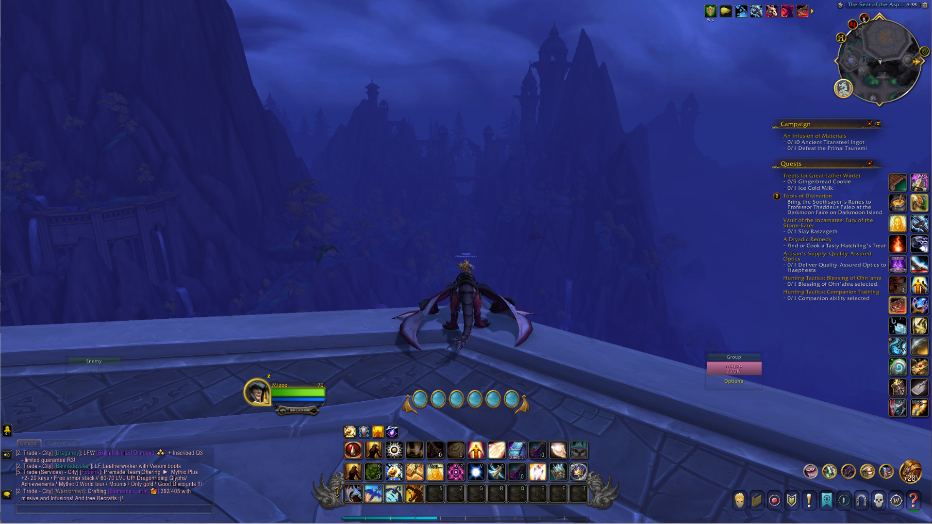
When the World of Warcraft team redesigned the UI experience, they were selective in what they could edit, leaving out important features such as the map, quest logs, and bags. This has caused a significant strain on players. While I can usually resize my settings, I have found that this is no longer possible unless I switch to window mode, which is frustrating and takes away from the immersive experience. As shown in Figure 2.1, this becomes especially problematic when playing on an ultra-wide monitor. Similar to the Micro Menu, many elements that were previously editable with add-ons in previous expansions are now unavailable or buggy in the new update. In contrast, games like Overwatch (shown in Figure 2.2) automatically adjust the screen for the player, and games like The Witcher (shown in Figure 2.3) adjust the UI to fit the player's preferred vision without the need for add-ons.
World of Warcraft
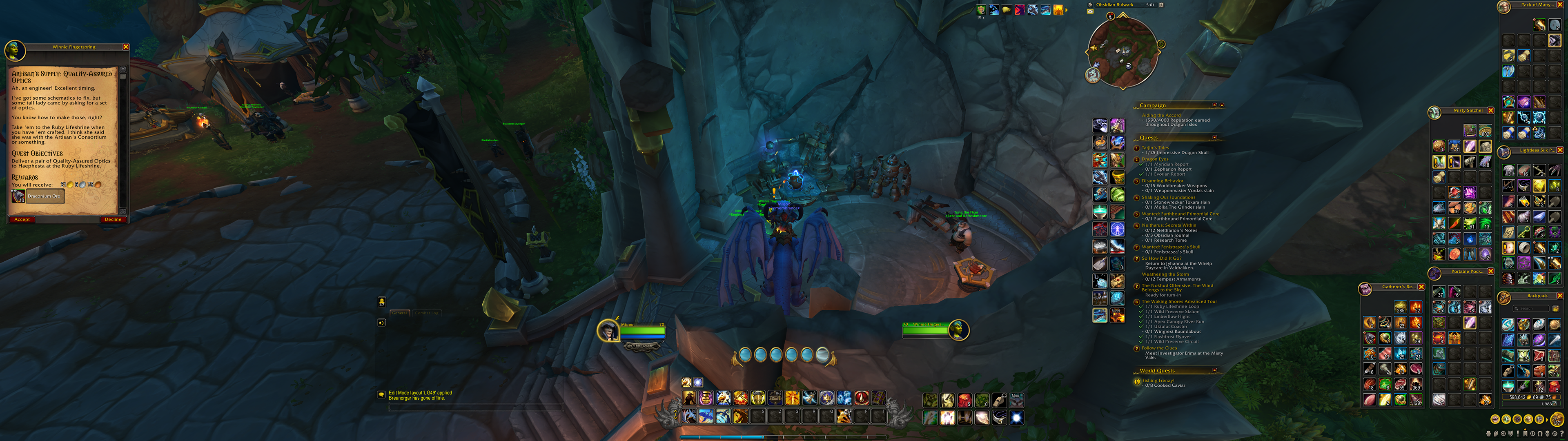
FIg 2.1
Overwatch
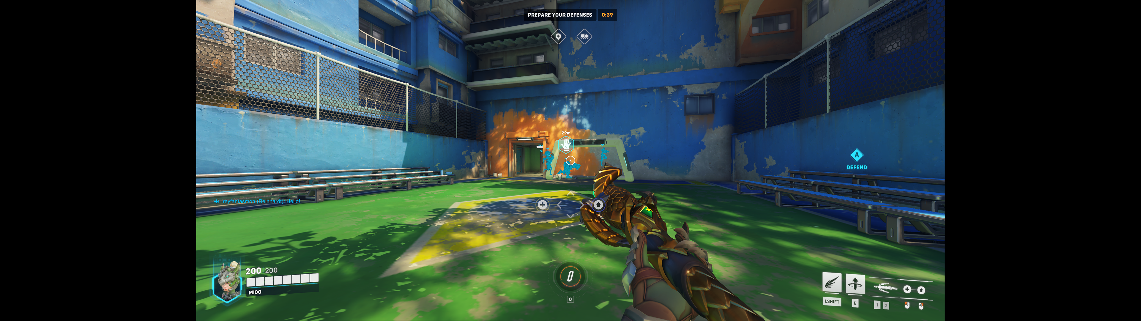
FIg 2.2
Witcher 3
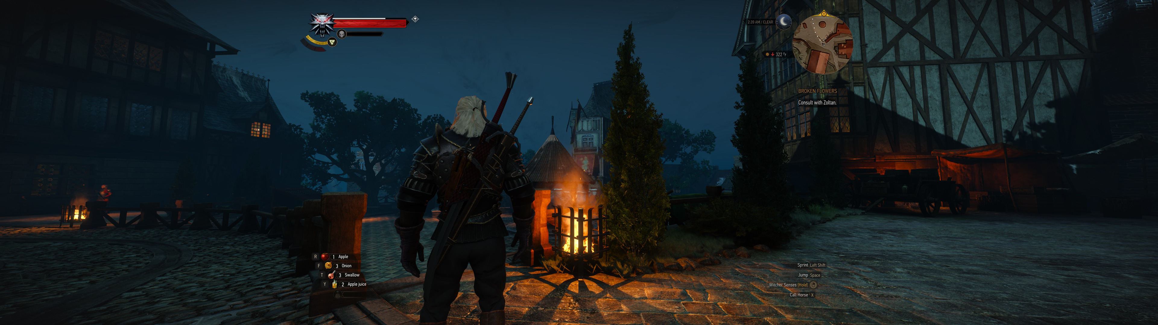
FIg 2.3
I was excited to hear about the Dragonflight expansion when it was revealed in a video featuring John Hight, the Franchise General Manager for Warcraft (as shown in Figure 2.4). Wide monitors have become increasingly popular in recent years, especially among creative professionals who need more than one screen. However, it is unfortunate that our peripheral vision does not have the same focused gaze as our central vision (as shown in Figure 2.5).
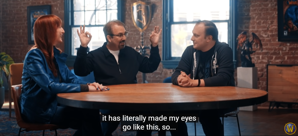
Fig 2.4 Click on the image to watch the video
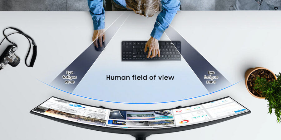
Fig 2.4 (https://insights.samsung.com/2022/04/13/curved-monitor-vs-flat-which-style-is-best-for-your-health/)
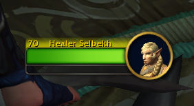
Fig 2.5
I hope that in future patches, Blizzard will unlock more features and give players greater control over the UI. While I am pleased that Blizzard is finally paying more attention to the user experience and interface, there is still a long way to go in terms of accessibility and inclusivity. For example, as shown in Figure 2.5, the name tag is yellow on yellow, which ignores contrast guidelines. Additionally, the accessibility menu only allows for scaling of a few elements in-game, not everything. As we discussed in the first part of this case study, the Micro Menu also has several issues that need to be addressed before it is fully accessible.
Despite these issues, I really enjoy playing World of Warcraft and have formed many close friendships, both in-game and in real life, through my years of playing. I want the best for this game and am excited for future patches and expansions.