Client: Zen Cafe (fictional)
Brief: App design and Website Design
Tools:: Adobe XD, Photoshop, Figma, Illustrator, 3Ds Max, Pen and Paper
Responsibilities:
- UX Designer
- Visual Designer
- UX Designer
- Visual Designer
The Problem
''Busy folks who lead a busy lifestyle and lack time to prepare healthy meals ''
The Goal
''Design an app and a website for Zen Cafe that allows users to easily customize and order a healthy different meal throughout the day''
Zen Cafe is a Local establishment whose target customer is too busy to prepare a healthy meal. The Cafe is located downtown where it’s mostly offices and next to a popular Fitness Gym, Zen Cafe Started as a small coffee house with selected snacks, but it expanded last year. They opened a salad bar which offers fresh organic ingredients and serves different dietary restrictions such as vegans, vegetarian and gluten-free. The Salad bar was a great addition to the cafe as it offers a variety of options and combinations.
Research
Researching the market and talking to a few people in my network about their needs and wants when ordering food online and what makes them prefer food ordering apps
over-preparing their own meals. I created a couple of personas based on repeated themes(image below). Then I created a competitive audit and I looked into companies that offer similar services. The companies I researched were: (Click here to see the competitive audit)
over-preparing their own meals. I created a couple of personas based on repeated themes(image below). Then I created a competitive audit and I looked into companies that offer similar services. The companies I researched were: (Click here to see the competitive audit)
- UberEats
- Door Dash
- Freshie
- Door Dash
- Freshie
User Flow Map
Wireframes (Paper and digital)
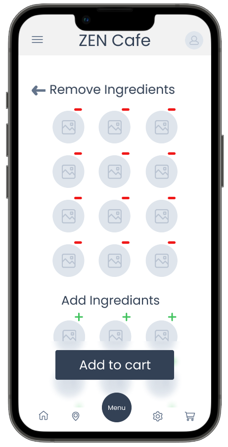
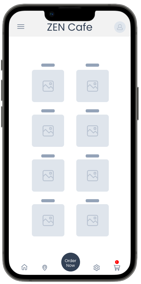
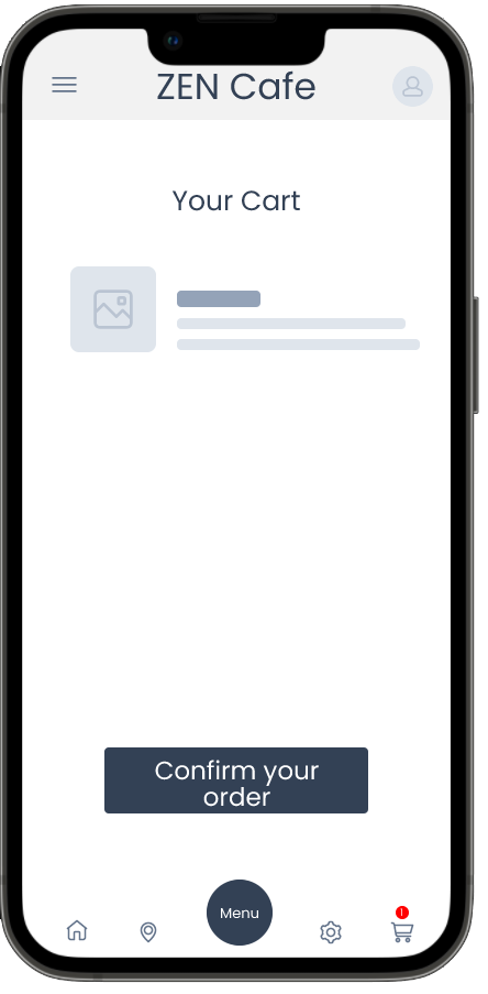
Taking the time to draft iterations of each app's screen on paper ensured that the elements that made it to digital wireframes would be well-suited to address user pain points. I prioritized a quick and easy ordering process for the home screen to help users save time.


Low fidelity prototype
Using the completed set of digital wireframes, I created a low-fidelity prototype. The primary user flow I connected with was building and ordering a customized meal so the prototype could be used in a usability study.
Tests and Pain Points
5 Users were selected to determine if they could complete customization tasks within the prototype of the Zen Cafe app and to see if the app is difficult to use. The study was unmoderated and each session lasted 5-10 minutes.
During the unmoderated usability study
A list of prompts appears on the device screen
Prompt 1: Pick a customizable meal from the menu
Prompt 1 Follow-up: How easy or difficult was this task to complete? Is there anything you would change about the process of finding customizable options?
Prompt 2: Customize the meal you picked
Prompt 2 Follow-up: How easy or difficult was adding or removing ingredients? Was finding specific ingredients easy
or difficult?
or difficult?
Prompt 3: Confirm your order and checkout
Prompt 3 follow-up: How easy or difficult was this task to complete? Is there anything you would change?Findings
- 80% of Users were confused and frustrated during the check-out process
- Users want a more accessible language
- Users want more customizations options
High-fidelity Prototype
The final high-fidelity prototype presented cleaner user flows for customizing a meal and created a better checkout process by looking at and reevaluating the wireframes and where it leads the users. I also looked at the UI and realized I could use the button's colours and clickability to show users where they need to go and guide them throughout the checkout process.
App Wireframe
Branding
Playing with different icons and elements representing Zen, relaxation and meditation. I took 3 different elements and I combined them into the logo Zen Cafe. The elements were Coffee Cup, Yin and Yang icon, and the lotus flower colours.
Website Wireframe
Final Designs
Takeaways
The Zen Cafe app was created to make busy folks' life easier and less complicated.
One quote from peer feedback:
“The app made it so easy and fun to build my own meal! It will definitely help me save time and gives me variations without worrying about it during my day.”
“The app made it so easy and fun to build my own meal! It will definitely help me save time and gives me variations without worrying about it during my day.”
What I learned:
I really enjoyed working in this process and I learned a lot about customization options and accessibility needs from my usability study. Research and testing are very important to understand and sympathize with users' needs.
Next steps
-Conduct another round of usability studies to validate whether the pain points users experienced have been effectively addressed.
-Conduct more user research to determine any new areas of need
-Conduct more user research to determine any new areas of need
